UX/UI Project · Enterprise Tool
Allinonetool
Camera Testing Tool 2.0
Redesigning how Microsoft's device teams validate camera quality —
from fragmented spreadsheets to one decision-ready platform.
Camera Testing Tool 2.0
Redesigning how Microsoft's device teams validate camera quality —
from fragmented spreadsheets to one decision-ready platform.
Microsoft's device quality program validates camera performance across Windows-certified devices before launch. Working across 15+ OEM partners and 80+ image quality metrics, the platform supported large-scale evaluation workflows used to review device readiness and camera consistency.
Camera Testing Tool 2.0 redesigned that workflow to make analysis faster, clearer, and easier to compare across devices.

Important results were scattered across multiple reports, making review and reporting slower.
Threshold references lived outside the tool, slowing analysis and increasing review errors.
Every cycle meant jumping between tools that were never meant to work together — uploading device data in one place, looking up thresholds in a separate document, cross-checking per-device reports, then hand-compiling everything into a vendor deliverable.

Teams had access to the data — but not a clear way to interpret it quickly. Interviews and workflow observation revealed the same issue: analysis was fragmented, manual, and difficult to navigate efficiently.
Work was spread across multiple tools
Testers constantly switched between reports just to compare results across devices.
Metrics lacked clear meaning
Testers could see the numbers, but not whether the results were actually good or bad.
Manual work filled the gaps
Teams relied on spreadsheets and hand-written summaries to complete analysis.
There was no unified overview
Understanding overall device quality required collecting information from multiple places.
The research revealed a consistent issue: the system showed data, but didn't support fast decision-making. These three goals guided the redesign — from workflow structure to interface behavior.
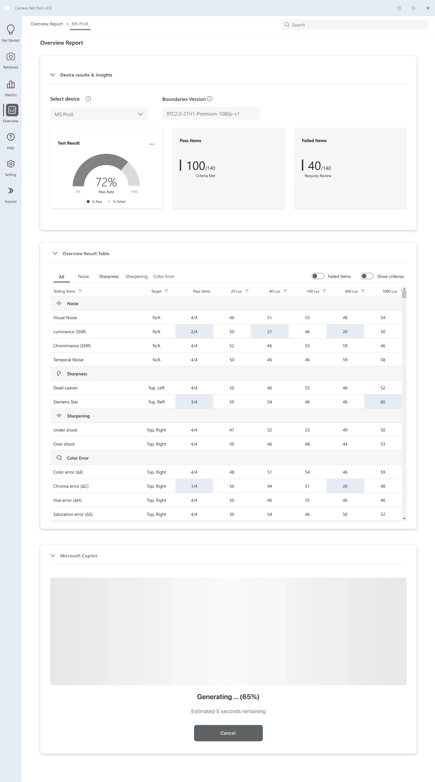
Surface failures and device health before deep analysis. Important issues should never be buried inside dense tables.
Users should compare devices in one unified view — without switching tabs or assembling reports manually.
Threshold guidance and interpretation should exist directly inside the interface, not in external documents.
Each flow traces a distinct user goal through the platform — with branching decision logic made explicit at every critical step.


The product structure was rebuilt around the real validation sequence, so each screen owns a clear decision point and reduces context switching for testers and PMs.

Low-fidelity layouts validated the IA and interaction model before any visual polish — each screen mapped to one moment in the workflow.
The IA was rebuilt around four sequential screens — each owning exactly one moment in the workflow. Every design choice below maps directly to a validated research finding.
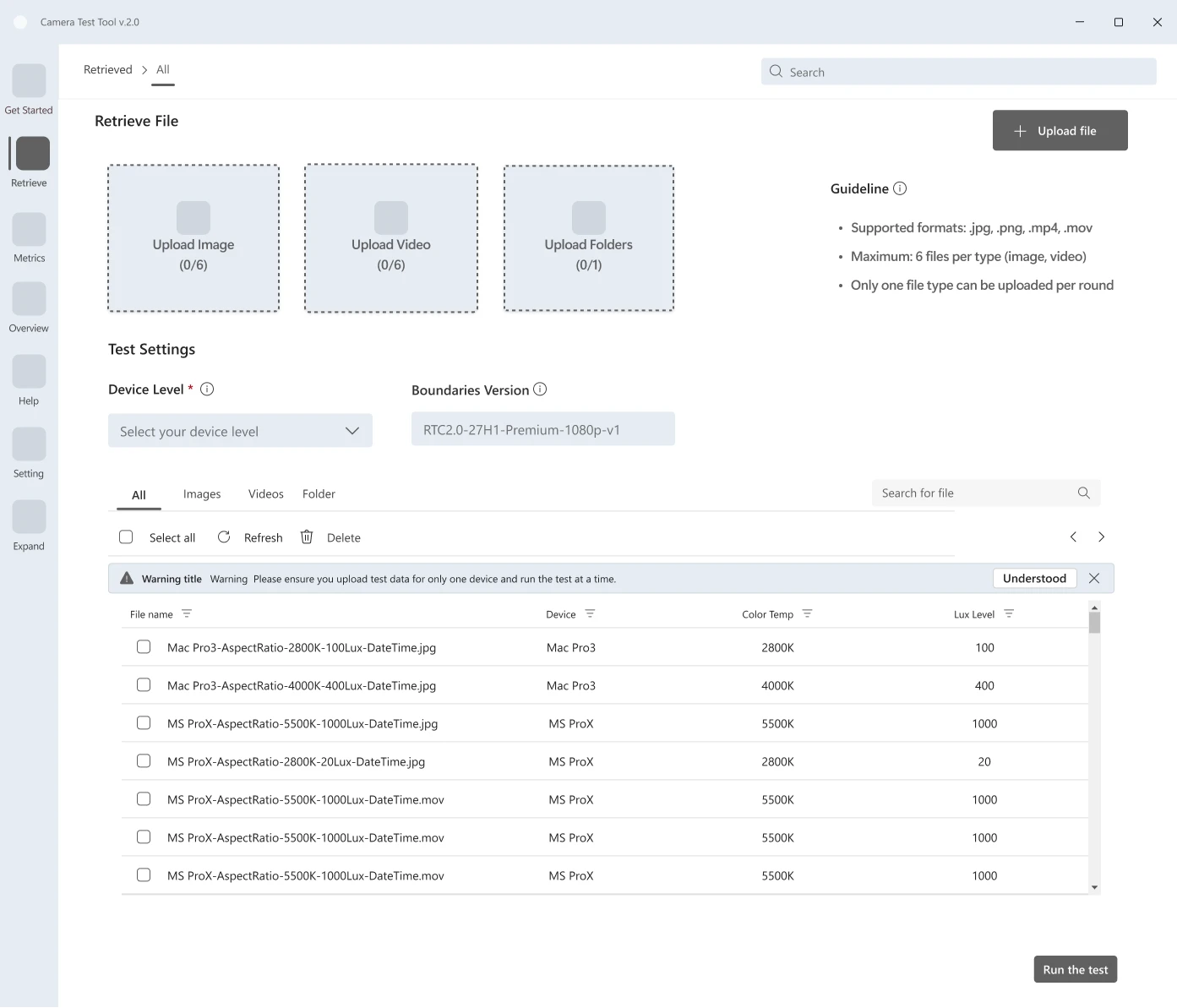
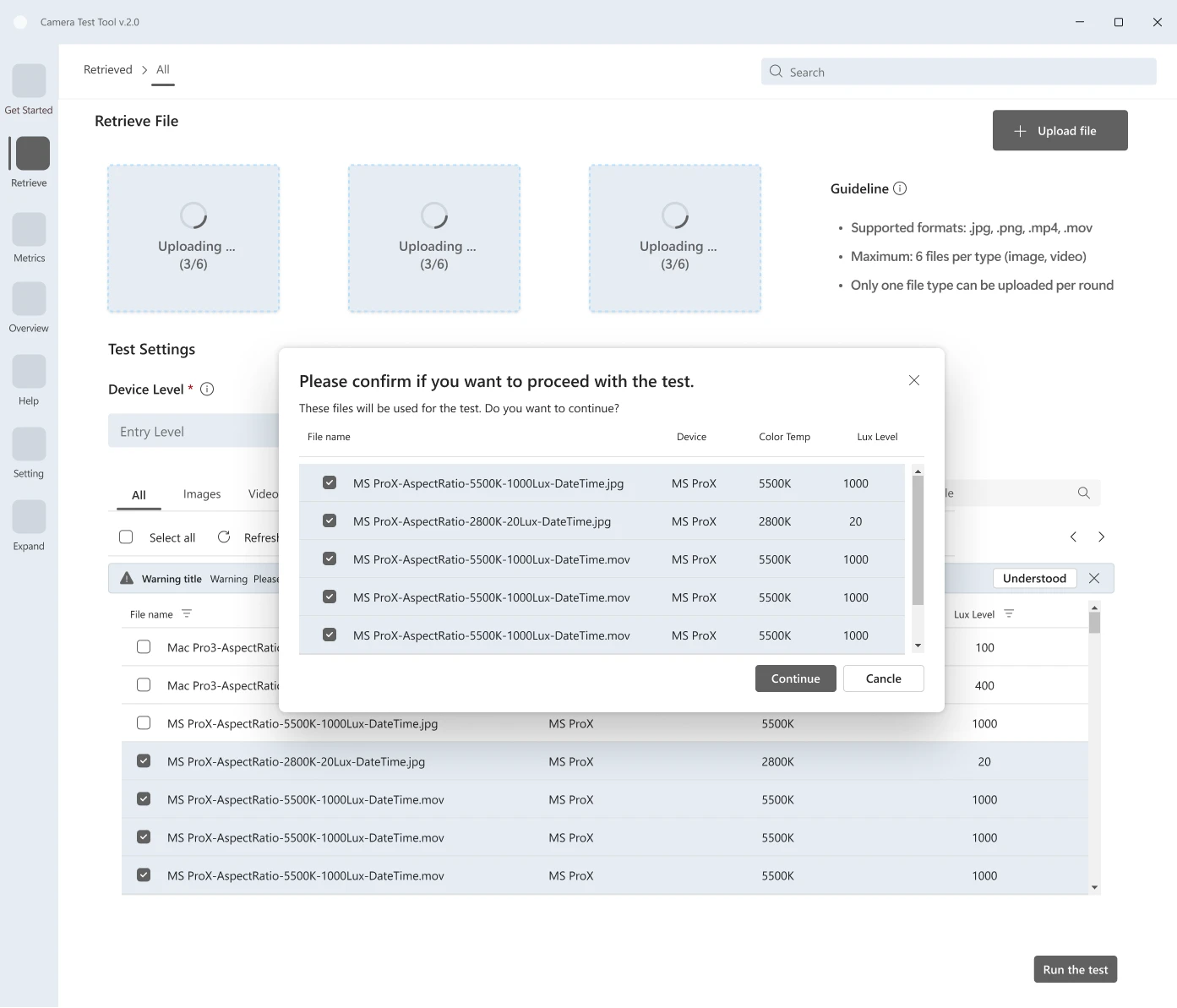
| Finding | Testers configured validation runs device-by-device — repeating the same setup steps for every hardware variant in a cycle, introducing inconsistency and wasting time. |
| Decision | Replaced single-device upload with a unified batch import flow. All devices are configured together in one session, with shared settings applied across the set. |
| Outcome | Consistent run configurations across devices. Reduced setup friction and eliminated a class of errors caused by per-device manual entry. |

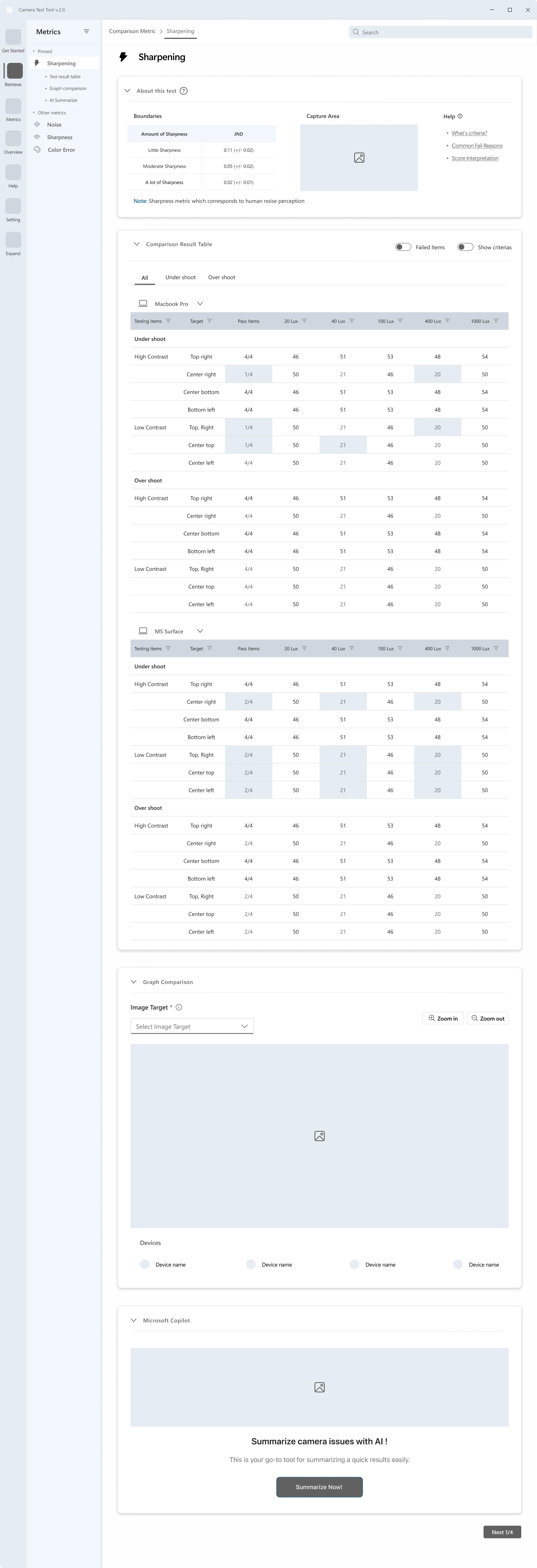
| Finding | Testers couldn't interpret metric values without knowing the threshold — so they constantly switched to an external reference sheet, breaking focus and slowing analysis. |
| Decision | Redesigned the results view to embed threshold context, pass/fail indicators, and boundary proximity directly alongside every metric value. |
| Outcome | Testers can read and interpret results without leaving the screen. Faster analysis and fewer missed failures at the boundary. |


| Finding | Comparing metric performance across devices required opening separate per-device reports — a fragmented experience that made spotting patterns across a vendor set nearly impossible. |
| Decision | Introduced a unified comparison layer with tabbed metric categories and device toggles, enabling side-by-side analysis without switching screens. |
| Outcome | Reduced time-to-insight on cross-device analysis. Decision-critical signals visible at a glance, not buried in sequential reports. |

| Finding | After analysis, PMs manually assembled validation results into a vendor deliverable — copying data out of the tool into a separate document, a process that took hours and varied in format. |
| Decision | Designed a final reporting layer that transforms validated results directly into a structured, vendor-ready summary. One action — no manual compilation. |
| Outcome | Report generation goes from hours to minutes. Consistent format across all vendor deliverables, regardless of who creates them. |

Every token was chosen to reduce visual noise — not for aesthetics. Color encodes status (pass / fail / at-risk). Typography keeps dense data tables scannable without feeling cluttered.


A geometric mark referencing a lens aperture — communicating measurement and validation, not photography.
Grid-anchored geometry over decorative form — data integrity over expression.
An internal tool for QA engineers and PMs — not end users. Restrained and functional by design.
Metrics estimated from workflow observation and PM review. Formal usability testing planned for Q2 2027.

Kochakorn demonstrated strong system thinking and quickly understood complex technical constraints, translating them into a clear, structured interface that improved metric visibility and usability. Her ability to simplify dense data views while maintaining accuracy was notable — as was her approach combining product mindset with execution discipline throughout the project.
In enterprise validation tools, every extra click scales into real errors. Reducing cognitive load isn't a preference — it's the most critical thing the interface can do.
N=1 access forced every insight to be cross-validated before informing a decision. The constraint raised the bar — findings had to earn their way in, not just appear.

